Visualizing penguins
Data
Python
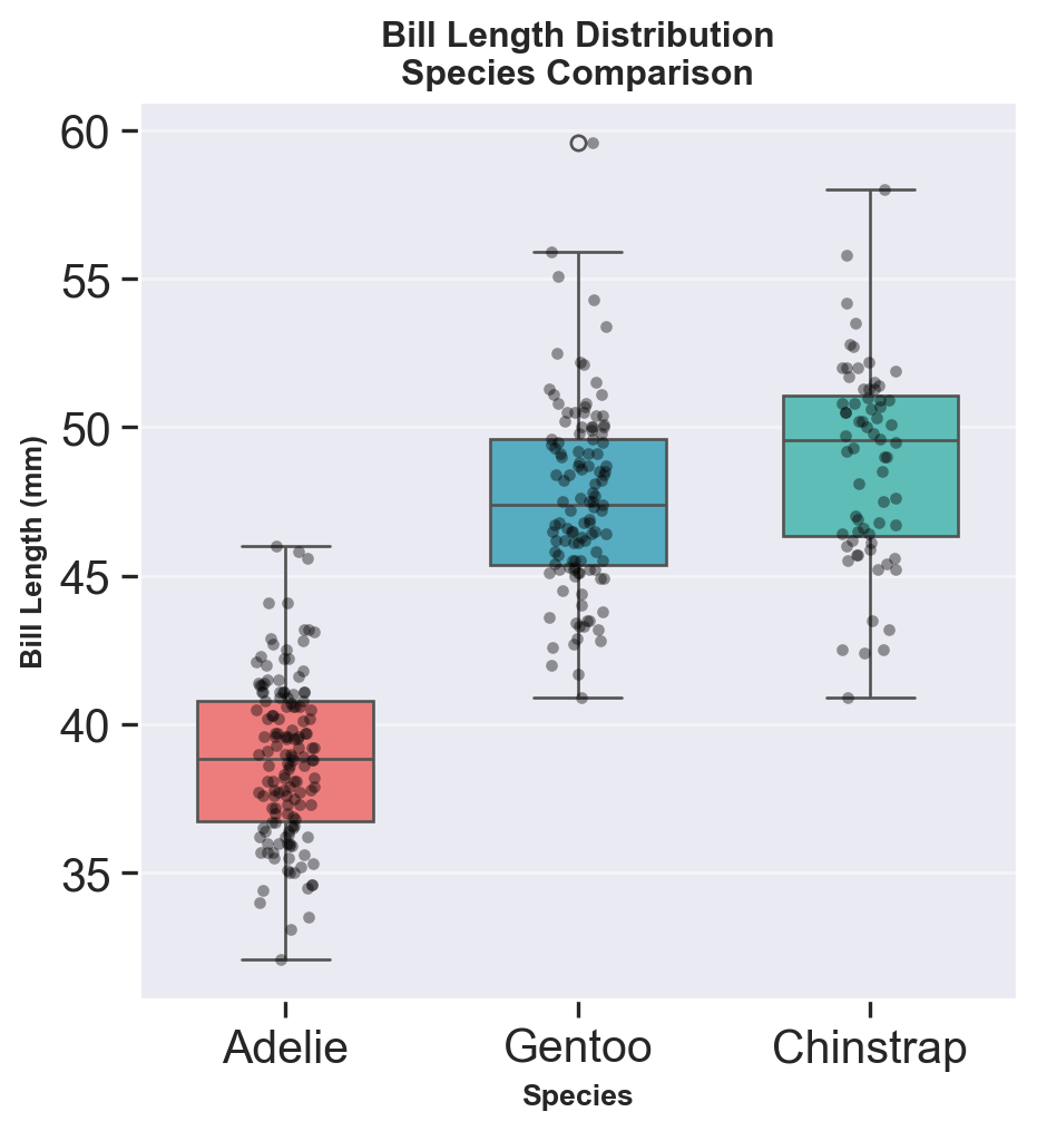
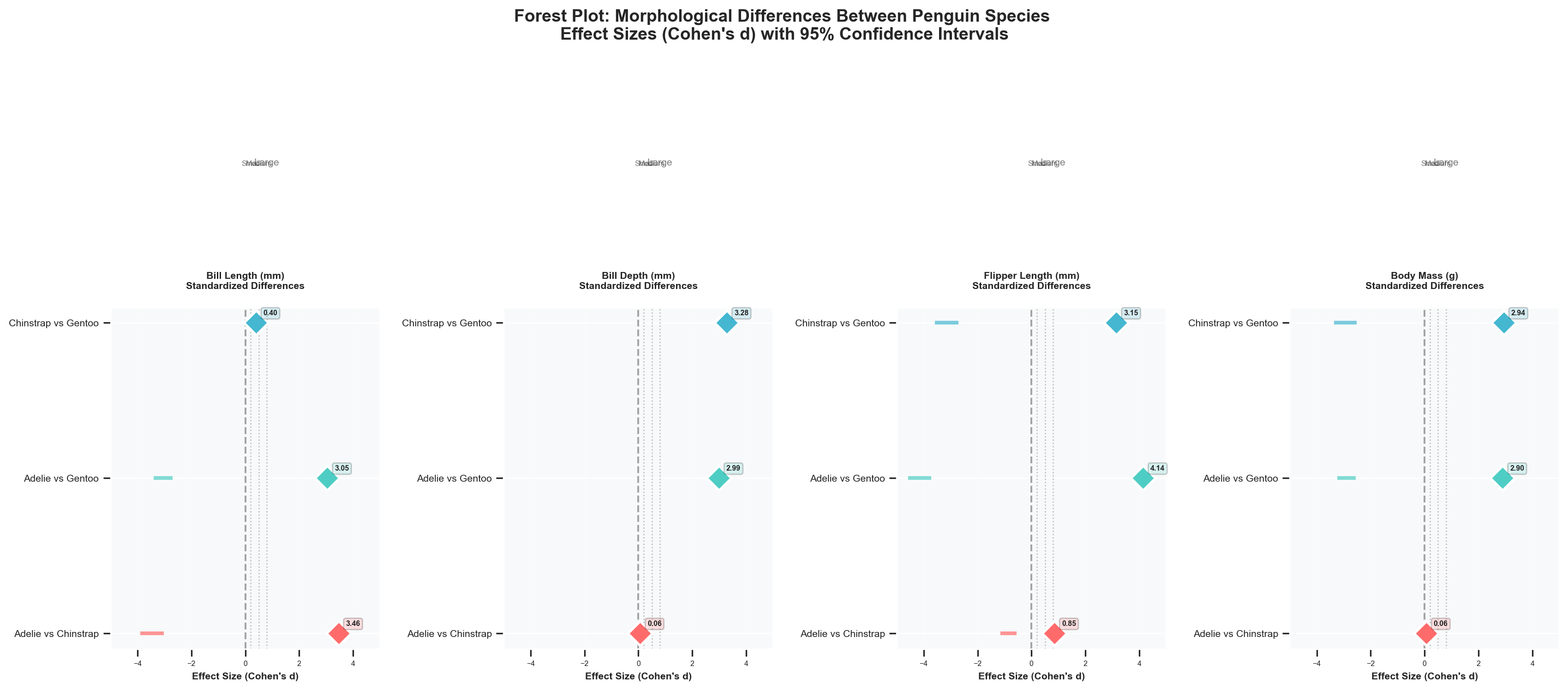
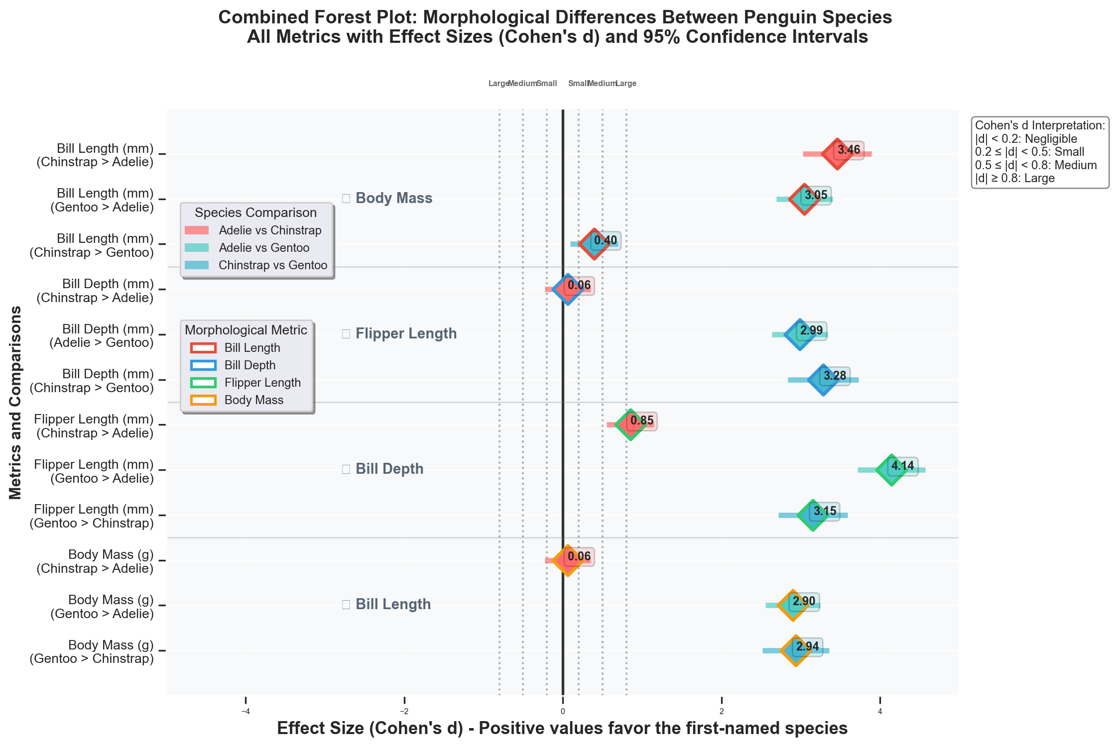
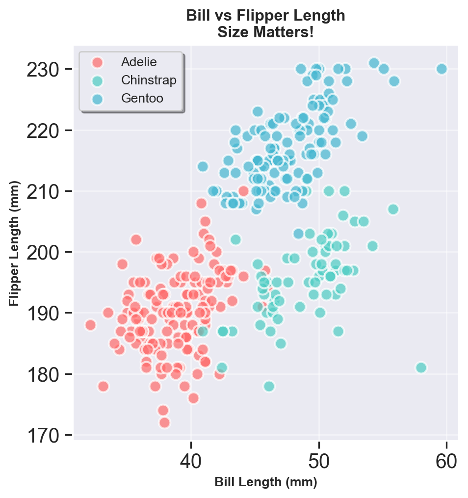
Toying with palmer penguins dataset
Here is what I did with the palmer penguins dataset in Python. I created a beautiful forest plot to visualize the standardized differences (Cohen’s d) between the three penguin species across four morphological metrics: bill length, bill depth, flipper length, and body mass. Each point represents the effect size for a specific comparison between two species, with confidence intervals shown as horizontal lines. The plot is designed to be visually appealing and informative, making it easy to interpret the differences between the species.
Hint: there were too many bugs and it took forever to get the codes right.
Original dataset is here: palmerpenguins on GitHub